Optimized Display of the Ios App on the iPad
by Gabriele Kaier, 24.06.2020
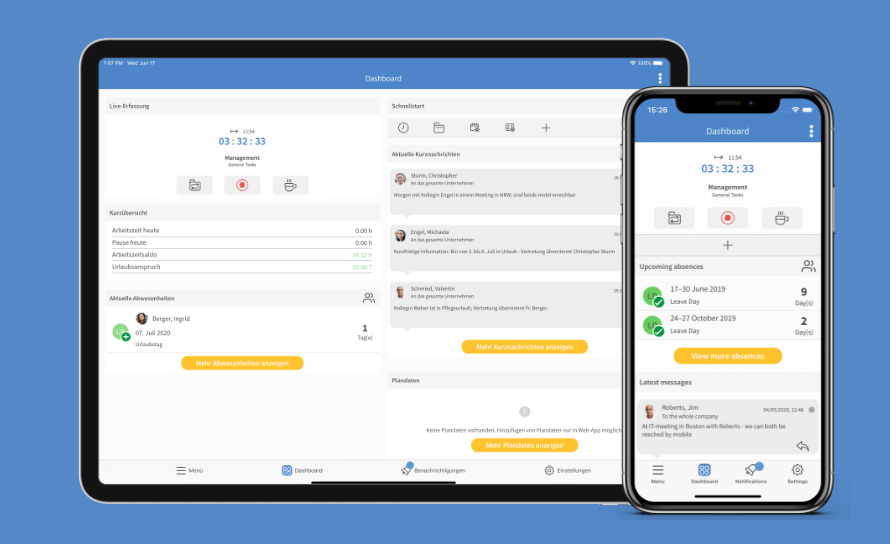
With the new version of the TimeTac iOS app, we have optimized the mobile usage on iPads for you. The app now adapts perfectly to the screen size of your iPad and allows for a clear overview of important functions for your time tracking. The improvements of the layout concern all configurations of the app, be it time tracking or leave mangement. In this blog post you can find out which ways of displaying content the app offers from now on.

What Changed in the New Version?
The new version of the iOS app manages to exploit the full width of the iPad with a 2-column design. This is how you can view detailed information without having to leave the menu item that you are currently in. The updated app allows for a split screen, a possibility to show two different contents on the display. You can simultaneously open another app or the web browser. The new app version for the iPad works on all tablets with iOS 10 and higher.Clear Overview on the Screen

Screenshots taken June 2020.
Detailed information, as e.g. to a timestamp, can be shown on the same screen.
Manage Tasks Simultaneously

With the aid of the split screen mode, you can open other apps without having to leave TimeTac.
How Can I Get the New Version of the Ios App?
The new version of the TimeTac app is available for free in the App Store from calendar week 28.New Display of Functions
Dashboard

You can arrange the items on the dashboard according to your preferences.
Timestamps

Details of a timestamp can be viewed at the same time.
Status Overview

The status of employees is displayed in a clear card layout.
Manage Requests

Leave requests and their details can be viewed on the same screen.
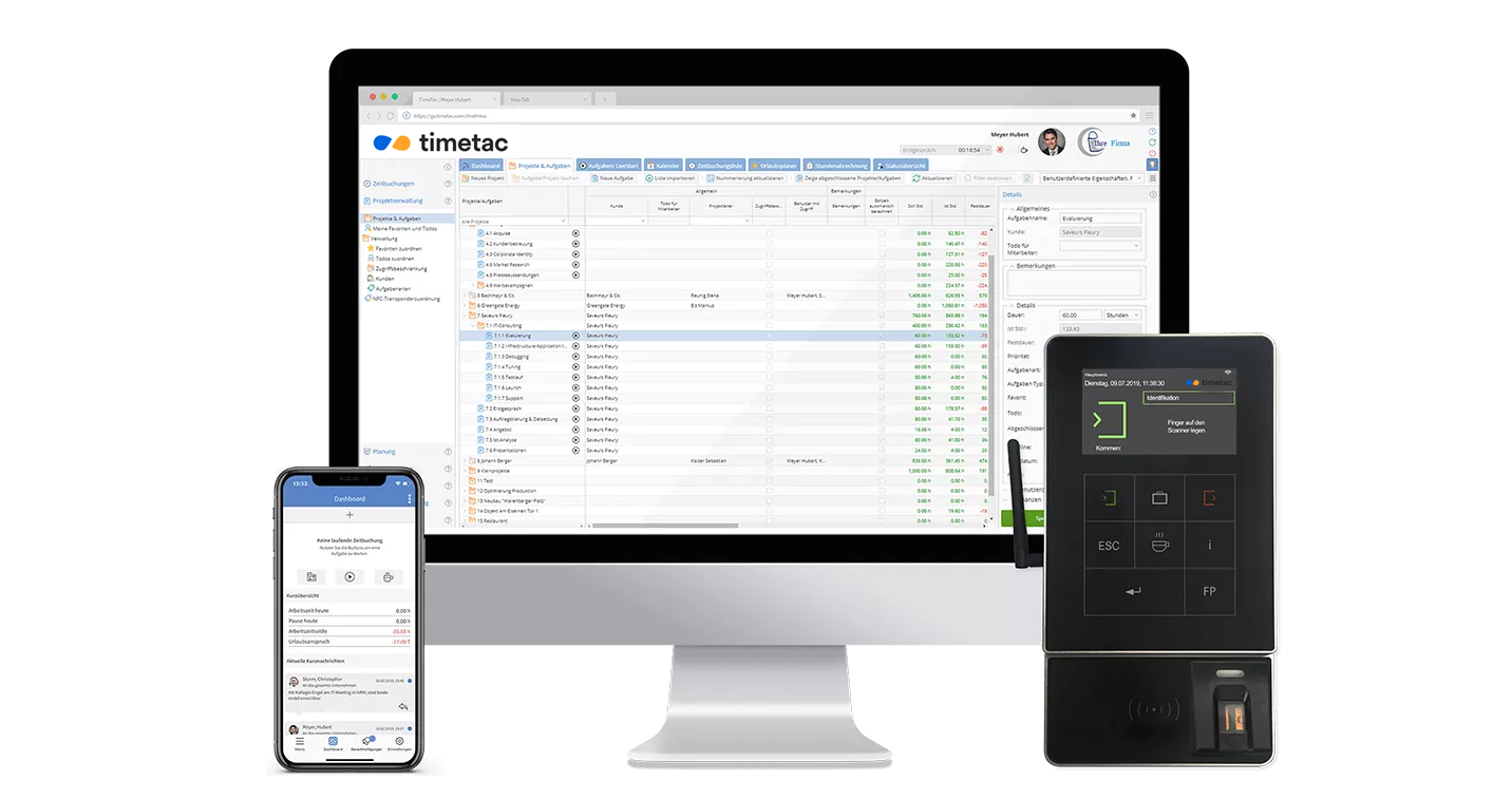
Time Tracking Is Always Available
With our apps, we offer flexibility in your time management.


