We Have a New Logo!
by Anna Eisner-Kollmann, 29.08.2023
You may not have expected it, but we're excited to share something with you! What happened, you may ask? TimeTac treated itself to an all-around visual makeover. We will proudly present our new corporate design in the next few months. Today, we are starting with a new logo.
A Fresh New Look
Tag along on our exciting corporate identity update journey. We’ll give you insights into our design philosophy and our logo evolution. First and foremost, we want to inform you about our logo change so that you won’t be surprised when the TimeTac logo on your smartphone, laptop, or tablet suddenly looks different from what you’re used to.
Why a New Logo?
We started our rebranding process a while ago. Key questions were: What are our values? What are our vision and goals? We let all these insights influence our design. Over the next few months, we will roll out our new corporate design. But first things thirst: We start with our logo.
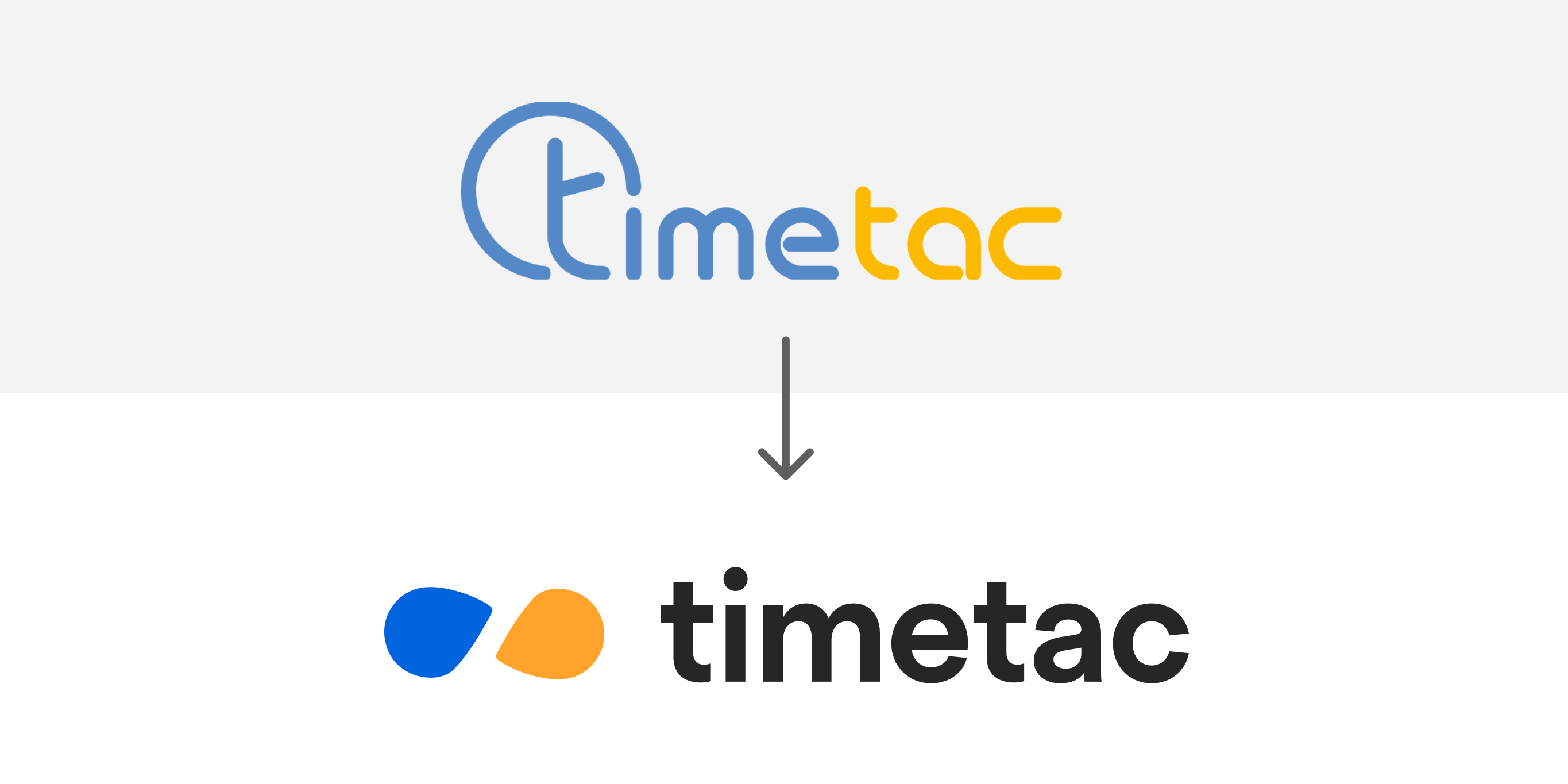
Our design and product management team worked together to create a new, unified, and fresh visual identity. The goal was to translate TimeTac’s core values into a consistent visual identity.
TimeTac’s Core Values
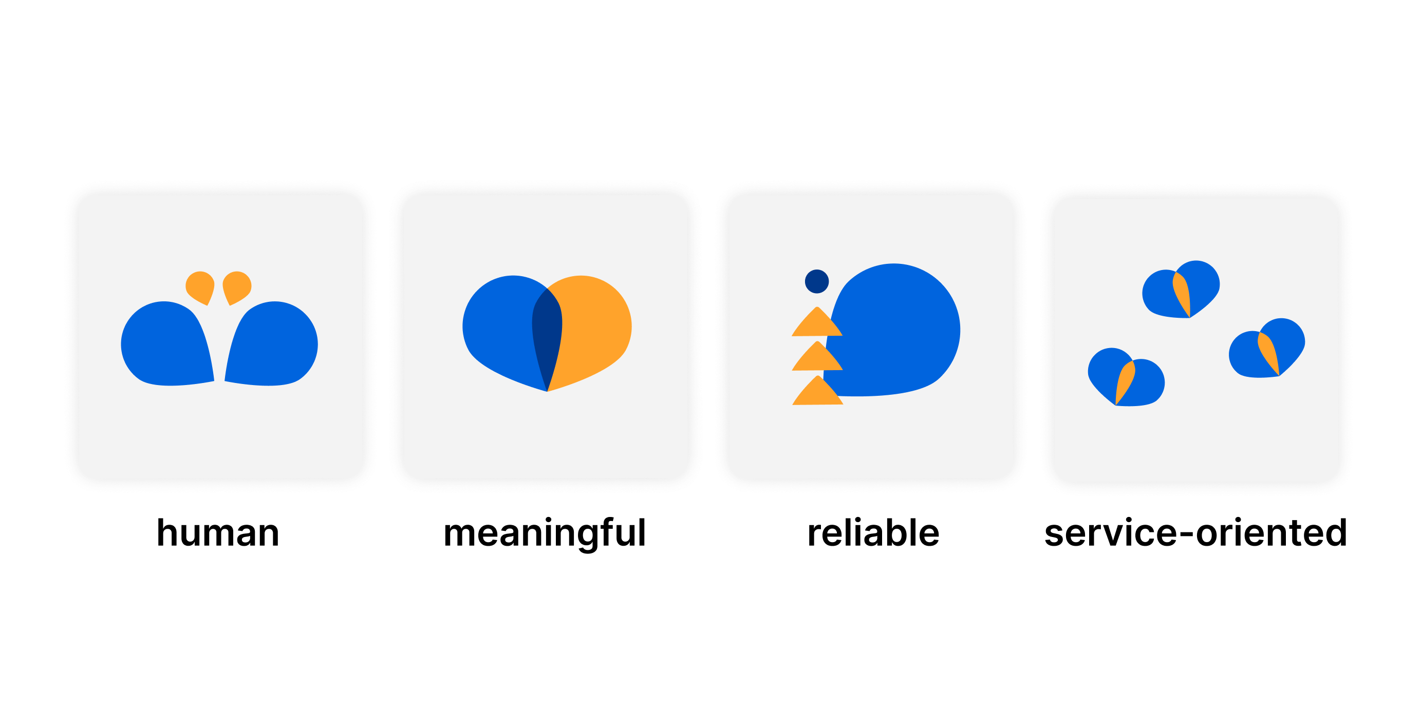
But of course, the new design should not only look good! It also has many great core values:
Accessibility: The corporate design in all its applications must fulfill accessibility standards. In order to fulfill these, overall legibility must be ensured by using an adequate (large enough) font size and enough contrast between font color and background color.
Clarity: All contents must be presented clearly and unambiguously, so users can understand them instantly. The corporate design is made for humans and, thus, must be tolerant and consider the human attention span and (in-)ability to perceive multiple contents at a time. A clear hierarchy helps the user to identify elements according to their importance.
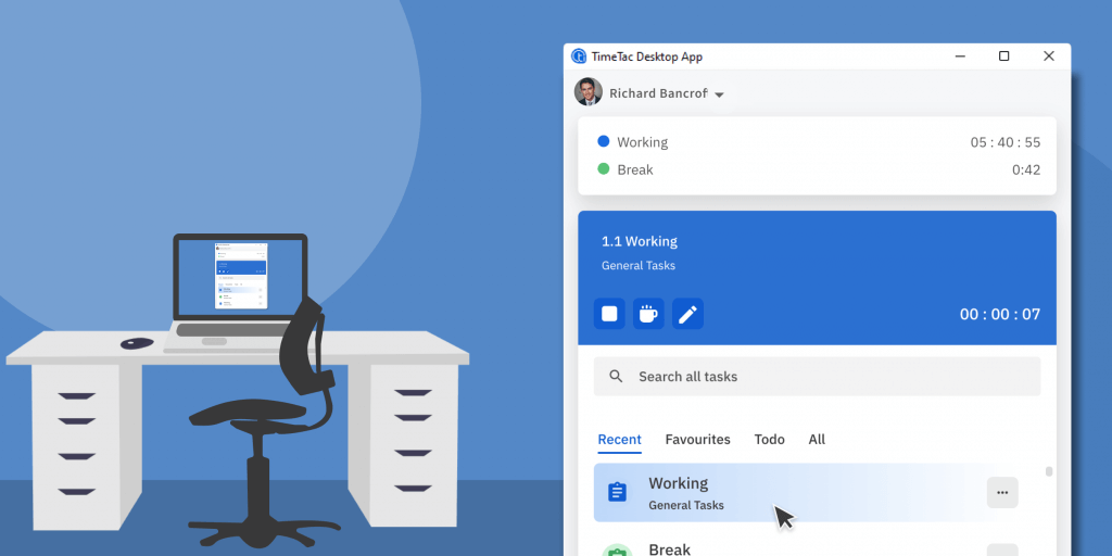
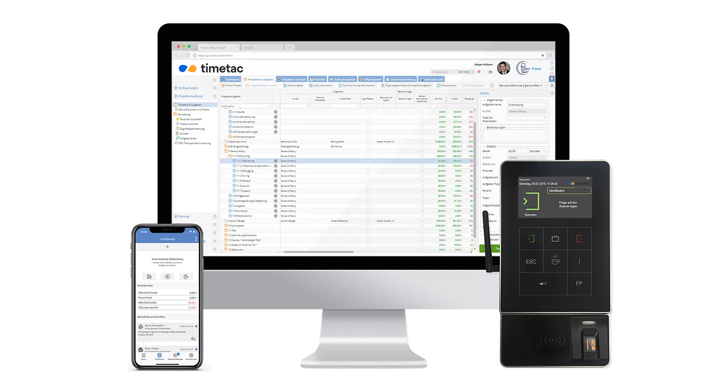
Meaning: The elements of the corporate design should be used meaningfully. Rather than solely for decorative purposes, the shapes can be used as a background for software screens or as a frame for photographs (see examples).
Consistency: One of the objectives of this corporate design is to create a consistent appearance of the brand. However, creating a design that fits the context is more important than persistently conforming to the design guidelines.
Our New Logo
The philosophical basis of the brand TimeTac is duality in different aspects. For example, the purpose of TimeTac’s software tool is to separate working time (attendance) from spare time transparently and correctly to avoid conflicts in the relationship between employer and employee. For TimeTac as a company, values like reliability or responsibility are essential, while the software product is built on progressive values like creativity and innovation.
Our new logo has two components: a strong but simple key visual and a sans-serif typeface. TimeTac’s key visual is created out of two rounded shapes to express the idea of duality and time. But it leaves some space for interpretation, so it could be an hourglass and the infinity symbol. What do you see when you look at our new logo?
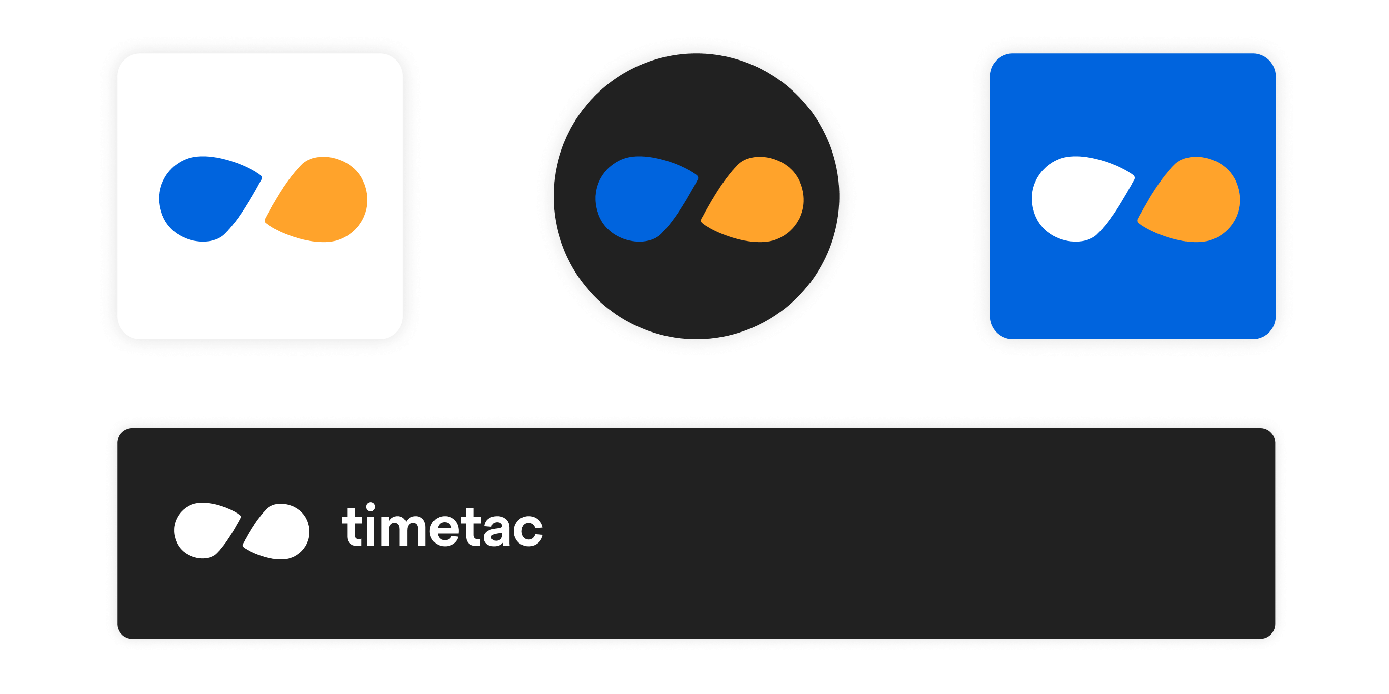
Because logos also need to be flexible in their design, our distinctive logo is available in different variants that you may see from time to time in the future.
Our New Colors
The findings of color psychology show that blue and orange are colors that fit TimeTac’s identity and values. Blue represents responsibility, security, trust, honesty, and competence. Orange color expresses friendliness, humanity, confidence, success, warmth, and excitement.
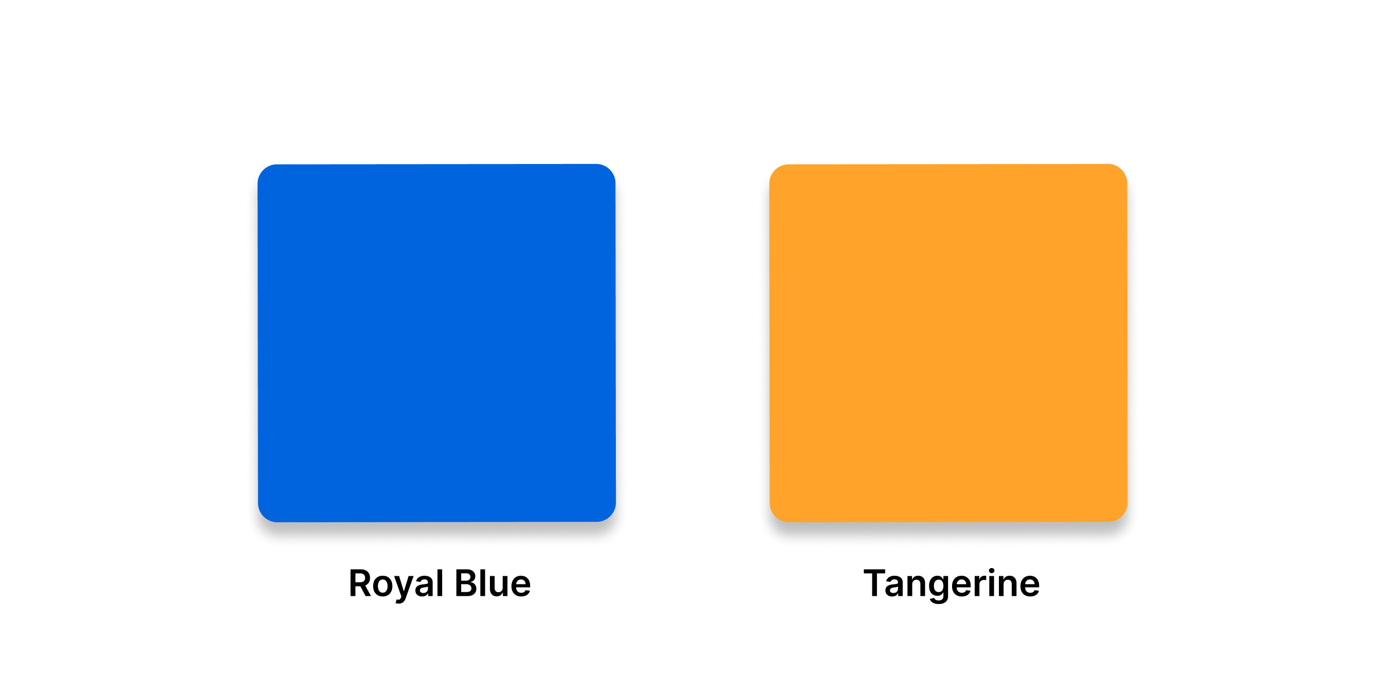
These rather contrasting characteristics represent the concept of duality (working time vs. leisure time) very well. Combining the two works well from an aesthetic point of view due to the fact that blue and orange are complementary colors. Thus, an additional dimension is added to the theme of duality.
What’s Next?
Over the next few months, you’ll see all other elements adapt to our new design: on the website, in advertising, and some places in the product.
We may have a new corporate identity, but we still follow the same mission: Across the globe, we help use time in a meaningful way!
